CASE STUDY 1
When Adventz Keventer came to us, they had land, a vision, and a launch date — but no name, no face, and no way to stand out in one of Kolkata's most competitive real estate markets. Here's how we built their brand from the ground up.
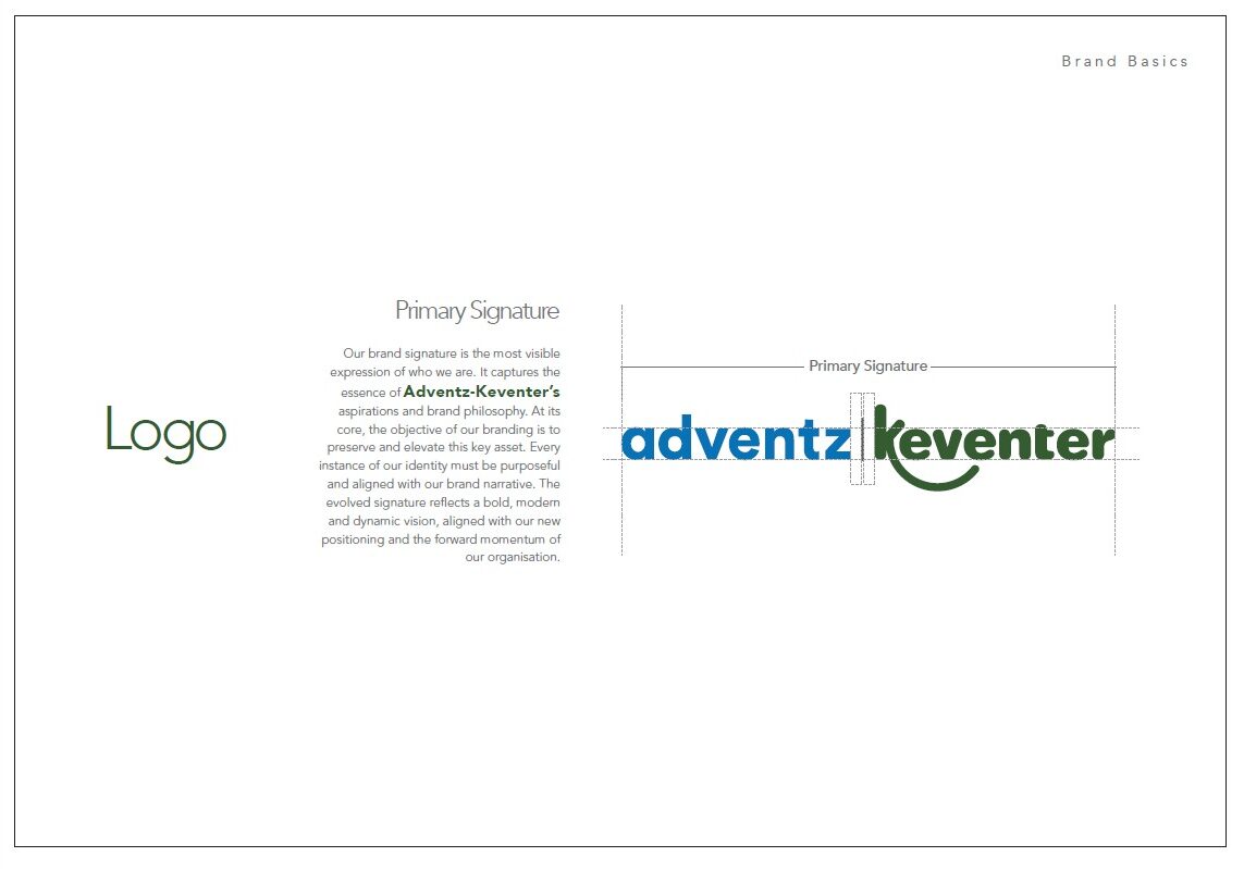
Keventer Realty, one of Kolkata’s most respected premium real estate companies, and Delhi-based Adventz Group joined forces to establish Adventz Keventer — a bold new real estate venture with projects lined up across Kolkata and Delhi. While the name had already been decided, we were brought in to build everything else: core brand components, brand style and creative guides, brand identity, a comprehensive brand manual, and sub-brand logos. Our intent from the outset was to break decisively from the cookie-cutter conventions that define real estate branding in Kolkata.
Listening to the New Indian Buyer
Research from Housing.com and Track2Realty revealed something profound: the pandemic hadn’t just changed where Indians lived — it had changed how they wanted to live. Home was no longer just home. It was office, sanctuary, classroom, and gym — all at once. Urban Indians now craved spaces that could flex and evolve alongside their lives. Wellness wasn’t simply a green courtyard in the complex; it was sunlight streaming through wider windows and greens growing on your own balcony. A servant’s quarter was no longer a luxury add-on — it had become a quiet, functional necessity.
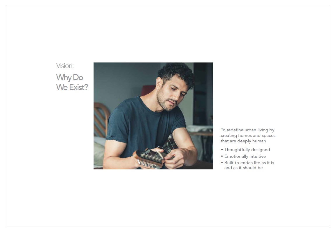
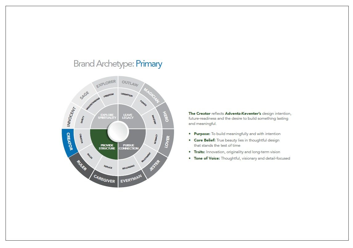
From this understanding of the modern buyer’s changing needs, we positioned Adventz Keventer as a Post-Pandemic Enterprise — an empathetic builder designing homes that aren’t just future-ready, but life-ready.
"Let's Build Life Together" — Four Words That Said It All
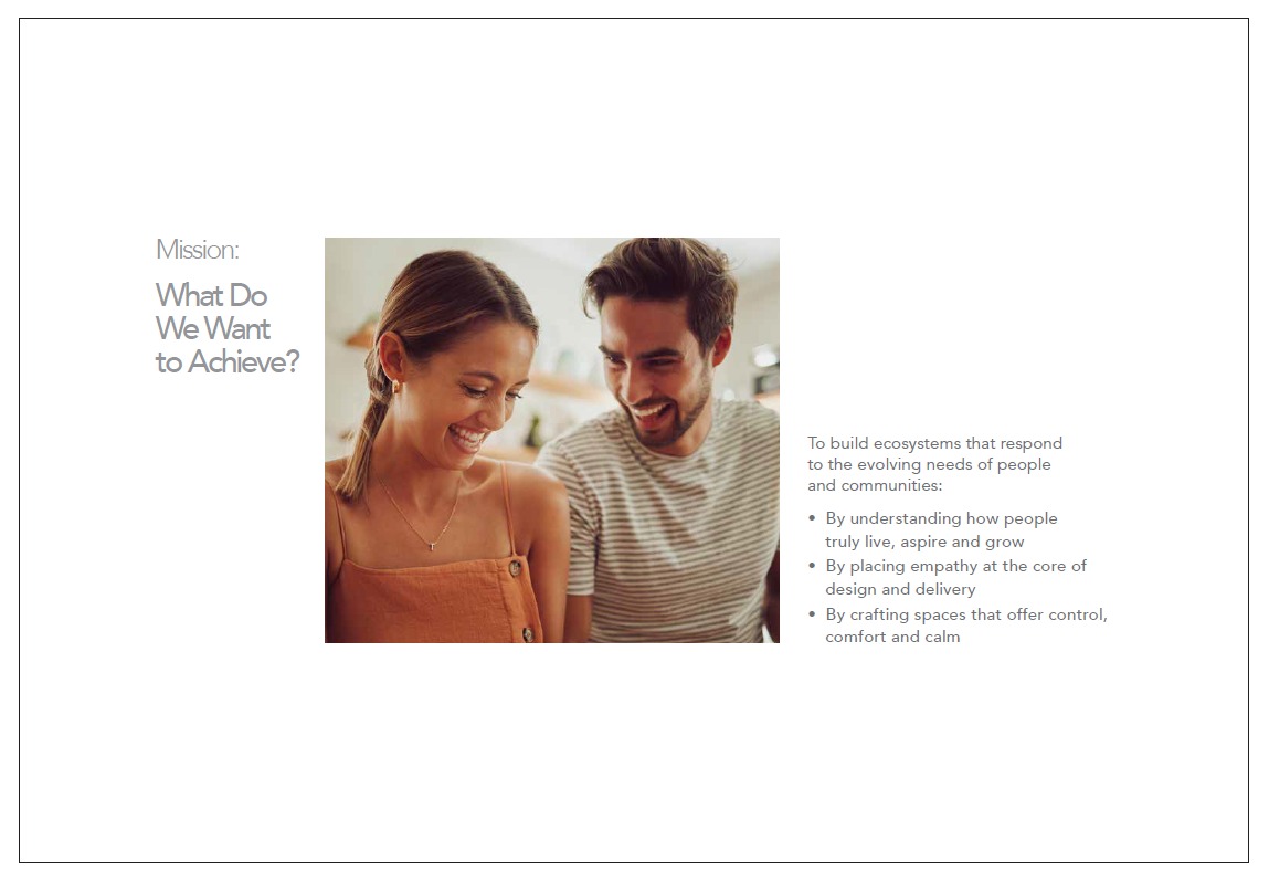
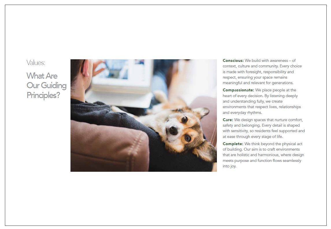
Their signature line became the natural culmination of this philosophy. The brand was built on four foundational promises: Conscious — building with deep awareness of context and culture; Compassionate — putting people’s desires at the centre of every decision; Care — creating spaces of comfort, safety, and belonging; and Complete — delivering environments that are holistic and harmonious.
A Visual Identity as Distinctive as the Brand
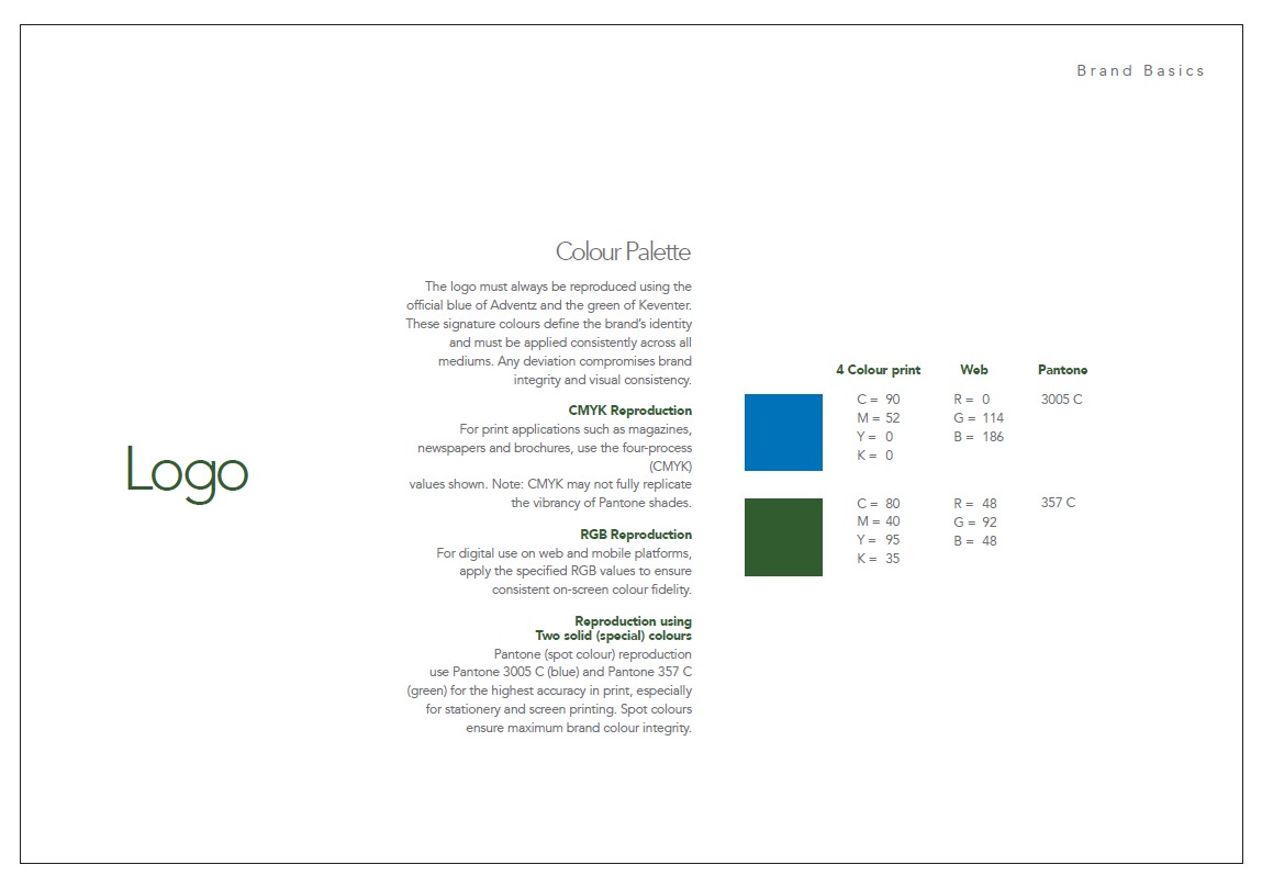
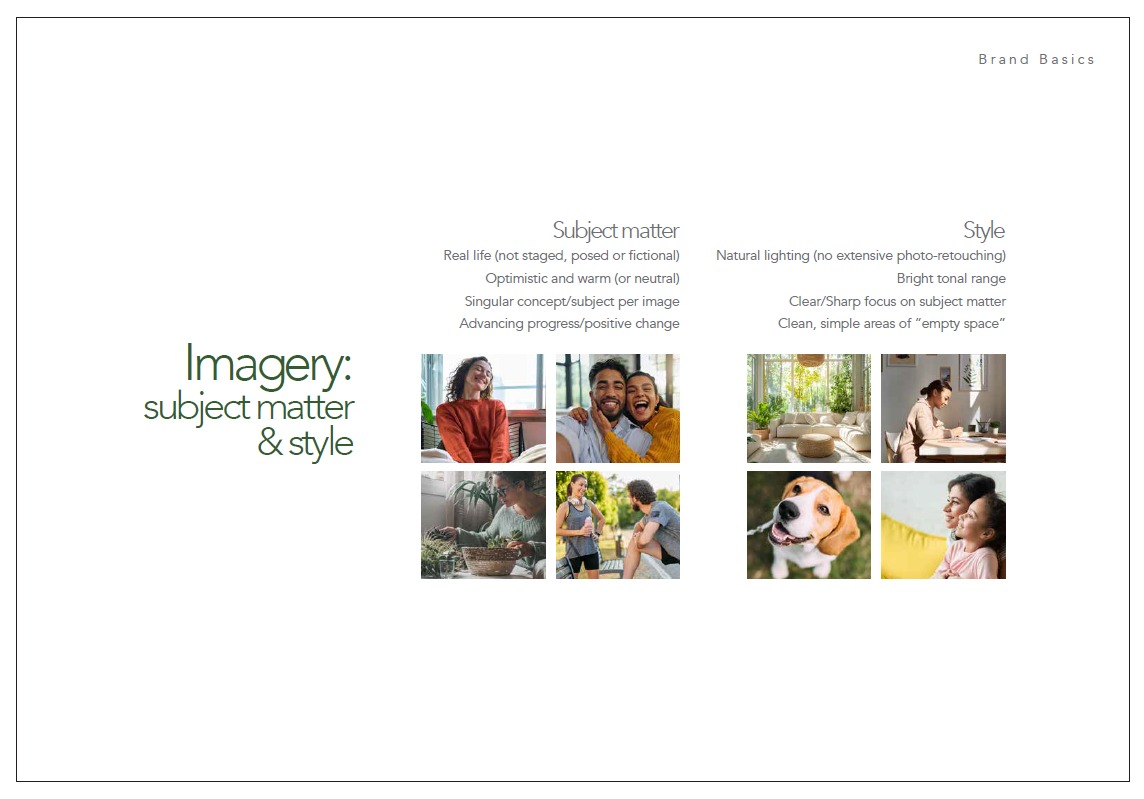
To create a truly differentiated visual presence, we developed animated line illustrations — each one depicting a specific housing or project type, from row housing to large residential developments. A dynamic moving logo was crafted for digital platforms, bringing the brand to life in motion. The colour palette was curated to evoke clarity, confidence, and quiet sophistication, with each shade carefully selected to ensure visual harmony and strong recall across all touchpoints. The brand’s tone of voice was calm, not clamorous — reassuring without being boastful, speaking with heart rather than hyperbole. The visual language leaned into abundant white space, natural textures, earthy tones, and clean typography: understated, quietly confident, and unmistakably people-first.
Introducing Mysa — A Sub-Brand That Found Its Own Voice
Next came the brand positioning for Adventz Keventer’s debut residential sub-brand: Mysa. Drawing from its parent brand’s philosophy, Mysa found a distinct expression through its signature line — “Live Limitless.” While Adventz Keventer’s overarching manifesto culminates in Live Complete — a holistic vision of living that balances ambition with peace, and privacy with connection — Mysa evolved this thought into something more kinetic: Live Better. Live More. Live Limitless. Three pillars, each rooted in a core product USP — more space, better living, and elevated amenities — crafted to resonate with the ever-evolving lifestyle of urban millennials.
Where the Brand Came to Life — "Apna Ghar"
We extended Mysa’s philosophy into the design of its experience centre. Rather than a sterile showroom, we conceived an intimate, lived-in space — complete with a pantry, a curated library, and a play area for children. We called it Apna Ghar, and the idea was simple but powerful: to make people feel genuinely at home in a space that existed, at that point, only on paper. We also proposed an AI-enabled design platform that would allow customers to visualise and personalise their apartments — turning aspiration into something you could almost touch.
The Naming Idea That Almost Made It
With the first residential project already named Mysa, we took on the challenge of naming the second — a row-housing development. Our proposal: Myra. The thinking was elegant — the prefix “My” would become a signature device across the portfolio, symbolising personal ownership and the deep emotional connection between a resident and their home. The client loved it, initially. But on closer analysis, we realised the “My-” prefix would quietly become a trap — limiting the naming pool available for future projects and, over time, blurring the distinction between a mid-range offering and a super-luxury one. So we let it go. The best ideas, sometimes, are the ones you’re brave enough to leave behind.